Modal
Modals are a variant of dialog used to present critical information or request user input needed to complete a user’s workflow.
Demo Modal
Are you sure want to delete this Item ?
Modal body text goes here.
Live modal
Click here 👇 to see live demo modal.
Subscribe to our newsletter
Text Utilities
This UI provides user with utility classes, using which you can get rid of writing extra css code. These Text Utility Classes are available for your convenient use.
Headings
This UI provides utilities for headings, you can simply assign header tag and it will assign predefined line height and font-size to them automatically.
H1 Heading
H2 Heading
H3 Heading
H4 Heading
H5 Heading
H6 Heading
Text Size
This UI provides text variable types of utility classes with predefined font-size and line-height for each of them.
Extra Small Text
Small Text
Medium Text
Large Text
Extra Large Text
Gray Text
Extra Large Text
Avatar
Avatar is an icon or figure representing a particular user in internet forum. This UI provides user with varities of avatars.
An avatar component is a profile image often used in combo with additional elements (e.g., a status element) to provide additional info about a user.
The Avatar component is typically used to display images, icons, or initials representing people or other entities.
Round Avatars with different sizes.
This UI provides user with all sizes of circular avatars i.e. x-small, small, medium and large.

Copy & paste the below html template to use these components in your projects.
Square shape Avatars

Copy & paste the below html template to use these components in your projects.
Triangle shapse Avatars

Cards
Cards contain content and actions about a single subject. Cards are surfaces that display content and actions on a single topic. They are easy to scan for relevant and actionable information.
This UI provides different categories of cards to the user. It takes accountability for the user needs, uses reusable classes, for getting your tasks done sooner.
Cards with different sizes
Vertical Card
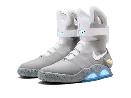
2016 Self-Lacing Nike MAG:
Sold via: Private auction
Sale price:$110,000
Horizontal Card
2016 Self-Lacing Nike MAG:
Sold via: Private auction
Sale price:$114,000

Good things take time.


Extreme $1,000,000 Hide And Seek
Mr beast
100M views • Jan 1, 2023
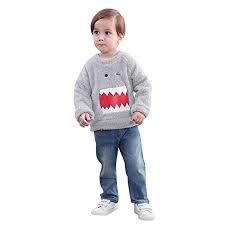
Sweaters for Childrens
Customized Sweaters
Sold by: Lil Picks
Boy's and Girl's Woolen Regular Fit, Round Neck, Stripped Winter Wear.

New
Large Title
Small Title
Rs. 1345 1495(10% OFF)
Trending
Large Title
Small Title
Rs. 1345 1495(10% OFF)
Buttons
The Button component allows user to take action such as submitting a form, opening a dialog, canceling an action, or performing a delete operation. Buttons are clickable elements that are used to trigger actions. They communicate calls to action to the user and allow users to interact with pages in a variety of ways. Button labels express what action will occur when the user interacts with it.
When to use: Use buttons to communicate actions users can take and to allow users to interact with the page. Each page should have one primary button, and any remaining calls to action should be represented as lower emphasis buttons.
When not to use: Do not use buttons as navigational elements. Instead, use links when the desired action is to take the user to a new page.This UI provides user with varities of buttons, i.e. simple buttons, outline buttons,icon buttons, and floating action buttons..
Simple Button
Just add below given class to create a button . You can use additional classes like Primary, Sign in, Sign out, Login on your choice.
Outline Buttons
Icon Buttons
Floating Action Button
Alerts
An alert displays a short, important message in a way that attracts the user's attention without interrupting the user's task.
Alerts are urgent interruptions, requiring acknowledgment, that inform the user about a situation. This UI includes alerts as per the usability of the user. It takes accountability for the user needs, uses reusable classes, for getting your tasks done sooner.
Basic alerts
The alert offers four severity levels that set a distinctive icon and color.
Success alert
Info alert.
Warning alert.
Error alert.
SnackBar
Snackbars provide brief notifications. The component is also known as a toast.
Click here 👇 to see live demo modal.
Badge
Badges are small circles, positioned either at top-right or bottom-right of the parent component.
The badge component can be used to complement other elements such as buttons or text elements as a label or to show the count of a given data, such as the number of comments for an article or how much time has passed by since a comment has been made. This UI provides you badges with customizable pre-defined classes.
Status Badge
Badges are used to display a notification count or status information.
Text Badge
Right side text with badge
999
left side text with badge
999
Icon Badge
List
List groups are a flexible and powerful component for displaying a series of content. Modify and extend them to support just about any content within.
Simple Lists
- Avatar
- Slider
- List
- Images
- Input
Components
Stacked List
-
Abhijeet Ekad
Hello!! How are you
16.24
-
Abhijeet Ekad
Hello!! How are you
16.24
-
Abhijeet Ekad
Hello!! How are you
16.24
-
Abhijeet Ekad
Hello!! How are you
16.24
Images
Images can be responsive to fit the parent's width, and also can be customised to be round shaped.
Responsive Image

Round Image
Circular images usedfull for profile photos and icons.
Input
Various forms and Inputs. Inputs are necessary for user interaction with the website. Inputs are used to take information from the user, and then save the data.Inputs are very important when it comes to interacting with the user, or is also useful for taking responses from the user.
Input - TextArea
Use class input to form a basic input
Input's with different labels
Use class input to form a basic input
Errored / successful inputs
Inputs with options
Grids
You can use these grids for basic layouts.